The Monarch Flour Mystery: Almost Solved

General discussion of map projections.
Post Reply
quadibloc
Posts: 292
Joined: Sun Aug 18, 2019 12:28 am

The Monarch Flour Mystery: Almost Solved

Post by quadibloc »

The Van der Grinten III projection is the one where the parallels are horizontal lines, at the positions the parallels of the original Van der Grinten projection intersect the central meridian.
I have noted on my web page that the Van der Grinten projection, along with the Van der Grinten IV projection, are interruptible, as their vertical scale (as well as the horizontal scale) at the equator. If this is so, then how much more so would it be true of the Van der Grinten III projection as well!
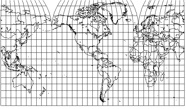
And so I added an illustration of this fact to my web site - not involving interruption, but instead slapping a Van der Grinten III projection of the Northern Hemisphere on to a Mercator projection of the Southern Hemisphere:
Image
And this immediately suggested to me a way of putting polar caps on top of a Mercator projection; the basic scaling method of superimposing a small Mercator grid on a Mercator map on a larger scale that can be used as a way to understand the Lagrange Conformal projection can be applied, along with a vertical displacement of that small Mercator grid.
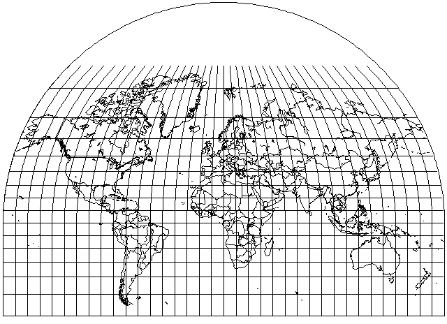
This led me to attempt the following reconstruction
Image
of a map, originally published in Canada by the Department of Trade and Commerce, 21 1/2 inches high and 36 inches wide, titled "Map of the World Showing Routs and Shortest Sailing Distances between Canada, the British Empire, and Foreign Ports", which was reproduced in 1950, with the coloring modified to reflect postwar borders, in the Monarch World Atlas, a premium offered for purchasers of Monarch Flour.
The photograph I had seen of that map in that atlas, though, gives Greenland a somewhat more squashed appearance than in my attempted reconstruction, so in a way my scheme of making polar caps is better than what they used. (Although, since one can't really say that the Mercator projection is "better" than the Miller Cylindrical projection, for example, perhaps "more consistent with the rest of the map, which is on the Mercator Projection" would be more accurate than "better".)
A copy of the 1935 version of that map, published by the Department of Mines and Resources instead, is recorded as having been added to the collection of the Royal Geographical Society, but except for the photograph I saw in an old eBay sale, no record of the map seems to exist online.
Last edited by quadibloc on Tue Aug 20, 2024 4:57 am, edited 4 times in total.
Milo
Posts: 271
Joined: Fri Jan 22, 2021 11:11 am

Re: The Monarch Flour Mystery: Almost Solved

Post by Milo »

How are the domes over Eurasia arranged? You can tell from the curvature of the meridians that the map won't work if you simply glue the left edge to the right edge like you can for the cylindrical portion.
Last edited by Milo on Thu Jun 13, 2024 11:22 am, edited 1 time in total.
quadibloc
Posts: 292
Joined: Sun Aug 18, 2019 12:28 am

Re: The Monarch Flour Mystery: Almost Solved

Post by quadibloc »

Milo wrote: Thu Jun 13, 2024 8:37 amHow are the domes over Eurasia arranged? You can tell from the curvature of the meridians that the map won't work if you simpe glue the left edge to the right edge like you can for the cylindrical portion.
Yes, you're right. On the left of the map, the dome has 100 degrees East longitude as its standard meridian. On the right of the map, the dome has 85 degreed East longitude as its standard meridian.
I hadn't been expecting that; I learned it from careful study of the blurry image I had of the original map. Since the dome over North America extends for less than 180 degrees , I thought I would need a dome that extended for more than a hemisphere, but because of the differing central meridians, I didn't; none of the polar caps extend more than 90 degrees either way (and in some directions, they extend less) from their standard meridians.
I think I've also figured out why they bothered with the caps. I think it was mainly an aesthetic thing, to bring Canada's general shape on the map more in line with its actual shape than would be seen on a pure Mercator. After all, the map was made in Canada for Canadians.
Here is what the original looks like:
mon_mer_t.jpg
mon_mer_t.jpg (124.93 KiB) Viewed 13181 times
And, to make it clearer how my projection worked, here is what the original drawn image for one of the three polar caps looks like:
pct1.gif
pct1.gif (15.83 KiB) Viewed 13179 times
Why is the circle in the middle of such a large blank square? Because in order to attach it, it needs to be the same size. So I scale the Van der Grinten III map down by 50%, so it has the width of a hemisphere, and put it on the same size canvas as the Mercator so that the computation for the margins (the nature of which I've forgotten) will be the same.
A hemisphere goes on a world map, instead of the world going on a hemisphere map: the transform is basically the reverse of the one that created the Lagrange conformal, but the recieving Mercator grid also has its equator moved to 56 degrees North on the double-scale Mercator source map of the world.
Last edited by quadibloc on Thu Jun 13, 2024 1:51 pm, edited 1 time in total.
PeteD
Posts: 251
Joined: Mon Mar 08, 2021 9:59 am

Re: The Monarch Flour Mystery: Almost Solved

Post by PeteD »

Very interesting. Since the Mercator part extends from 60 N to 60 S, it provides a way to treat the northern and southern hemispheres a little bit less inconsistently when implementing dchalker's interruption scheme while still avoiding cutting through any continents – a cylindrical projection between 60 N and 60 S, domes for the Arctic, and an azimuthal projection for the Antarctic.
quadibloc
Posts: 292
Joined: Sun Aug 18, 2019 12:28 am

Re: The Monarch Flour Mystery: Almost Solved

Post by quadibloc »

I am red-faced now! Because all the atlas maps in the Monarch World Atlas, except for one of Canada on a conic projection, were on the Mercator projection, I had simply assumed, all the way from childhood, that the world map was also on the Mercator projection. But just now, as I was taking a closer look at my image of the original map, to confirm that its graticule was drawn in 20 degree intervals in both latitude and longitude... that I noticed that Africa and the equatorial portion of South America were oddly stretched.
The original map, unlike my reconstruction, wasn't in a version of the Mercator projection modified by the addition of round polar caps... no, it was something more British than that! It was in the Gall Stereographic projection!
So, of course, I needed to try again, and draw my own version of what that map really looked like. I ran into a few snags, needing a little debugging, as I had forgotten some of the details of how I implemented interrupted projections, but I persevered, and here it is:
Image
Since the images that I had shown as links are no longer working (yet my site is still up with those images!) I've replaced the ones in this thread only by attachments. I've now switched back to links, given the recent announcement, but the links are not displaying.
Post Reply