dchalker wrote: ↑Fri May 31, 2024 4:20 pmThanks, Pete. I agree 100% it "seems obvious". I've been baffled nobody was doing this already, like why is everybody just ok with Antarctica being a long rectangle if the solution is so obvious?
I find these arrangements to be rather ugly. They portray Antarctica as separate enough that it's hard to tell its relationship to the rest of the world (of your examples, only the Chalker-Lagrange comes even close to showing where Antarctica lies relative to Australia, and it still doesn't do a particularly good job of that, plus the massive distortion of Alaska makes focussing so much onto portraying Antarctica, specifically, correctly into a joke), yet attached enough that it gives the whole thing a weird shape. People are comfortable with maps that look like rectangles or circles. A circle
hanging off a rectangle? That's just awkward. And why the central meridian? If I had to choose just one meridian to attach Antarctica, I would go with where it comes closest to linking up with another continent: South America.
Your video game map isn't doing quite the same thing. It is quite clearly treating the Antarctica inset as being
square, not circular like all of your high-resolution examples. (Or, quite, possibly, you took the circular inset and padded it into a square by adding some fictitious water, which I suppose isn't going to stand out by the standards of a low-res video game map, but still isn't particularly accurate.)
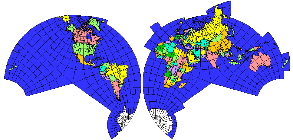
For most purposes it's better to do as atlases have always done: have a world map that shows the entire world contiguously, even if some of it is distorted, and then put whichever part you necessarily compromised on (probably Antarctica) in a separate map for the rare cases that people actually care what it looks like. Alternatively, polyhedral maps allow you to split the world into "parts" with locally low distortion that also carry over into each other smoothly. The
Peirce quincuncial projection, for example, looks quite good everywhere (including Antarctica) except for four discrete singularity points in the middle of the ocean, and it wraps around in a way that is quite convenient for video game use (as well as more "serious" numerical simulations). The math on that one can be a bit fiendish, and conformal projections aren't ideal for many applications, but I'm trying not to be too blatant about
plugging my own invention... aww, dammit.
In that thread, I also already floated the idea of attaching cylindrical and azimuthal projections together, although I suggested doing so for
both poles.
If you want everything to line up properly, though, you can't just arbitrarily make the cut at 60° and expect it to work. You have to pick the cutoff such that the lengths of the cutoff parallel on the cylindrical map and the azimuthal one are equal, and they connect smoothly. (For example, look at the Chalker-Peters map, and observe how the spacing between parallels suddenly changes suddenly and dramatically between the two components.)
For equal-area projections, for example, you get "cutoff_parallel = asin(1-cos(standard_parallel)^2/2)". For equidistant projections, you get "cutoff_parallel = pi/2-cos(standard_parallel)".
In both cases, any reasonable implementation (i.e., the cylindrical part doesn't look hideously ugly) would end up with the cutoff being far closer to the equator than 60°, therefore passing through continents rather than just the southern ocean. This makes sense: even the strip between 30°S and 30°N already covers 50% of Earth's surface, so expecting the cylindrical component to get a much bigger share than that is just greedy.
quadibloc wrote: ↑Fri May 31, 2024 5:20 pmGoldberg et al deserved the mockery that came their way, but one can note, in their defense, that maps in the projection they described tended not to appear in atlases very often - even maps showing the Eastern and Western hemispheres had gone out of fashion.
So without extensive research, they might well have thought their idea new. Rather than mocking them for their failure to do a more comprehensive literature search, I think they mainly deserved mockery for thinking that their projection was a good idea.
Even if nobody has done the
exact same thing as you before, if it's still very similar to long-known techniques, then you're not being all
that original. If you just want to devise a cute new map projection? Fine. If you want to claim that you're actually
solving a problem previous mapmakers have struggled with? Better make sure it's not a solution that those previous mapmakers were perfectly aware of, but chose not to use because of obvious flaws.