While in a way it sort of "looks better", my overall assessment was that if I seriously proposed this for use as a world map, people would laugh at me. But perhaps I'm not being objective.
I was speaking in an academic way, not in a mapmaker way.quadibloc wrote:You do? I find the Dietrich-Kitada interesting, and so I toyed with extracting a useful projection from its central hemisphere, but in general I've found "the general distribution of distortion" of the Dietrich-Kitada to be its greatest flaw, making it almost impossible to find an orientation of the world on that projection that makes an attractive map, with the high distortion all dumped in the middle of the ocean.daan wrote:but I like the overall distribution of distortion better on Dietrich–Kitada.
Oh. In that case, I agree with you. As noted, while I wasn't happy with the direct usefulness of the projection, its... distinctiveness... suggests that there's a way to tease out of it a projection that would be very useful in the mapmaker sense.daan wrote:I was speaking in an academic way, not in a mapmaker way.
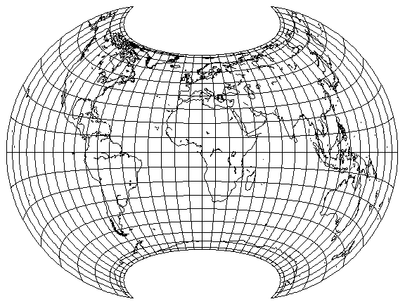
When I endeavored to duplicate your projection, I found that you had to reduce the stretch from 2, as in the Hammer projection, all the way down to 1.2 in order to get an apple shape.Atarimaster wrote:The outer shape is somewhat similar, and it is fully equal-area, but the graticule (and there, the distribution of distortion) is totally different. So in fact… it’s not very much like Dietrich-Kitada.
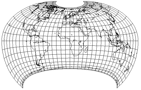
Yes, my goal here was that the point at the center of the map should have no angular deformation. I came close but did not achieve this totally. However to find the exact parameters would have been a lot of “try & err” for me, and since Geocart offers an “undistorted location” feature, I stopped there.quadibloc wrote: When I endeavored to duplicate your projection, I found that you had to reduce the stretch from 2, as in the Hammer projection, all the way down to 1.2 in order to get an apple shape.
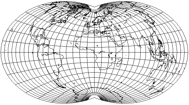
Nice, but…quadibloc wrote: This gave me some inspiration: while the shape obtained by reducing the stretch only to 1.5 was a sort of slightly apple-shaped outline which people would find strange, perhaps it might work well with short pole-lines:
Nice again!quadibloc wrote: I even tried an asymmetric version
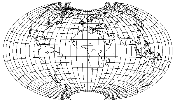
The one variation you show doesn't seem to be based on something apple-shaped; instead, it seems to be based on the ellipse.Atarimaster wrote:Dr. Rolf Böhm came up with a very similar variation [1][2] (his pole lines are a bit longer and the curcature of the parallels is a bit less pronounced)
I didn’t want to claim that it was based on something apple-shaped (in case it seemed that way), but I found it interesting that you two arrive at almost the same point, coming from two different sides – in a manner of speaking.quadibloc wrote: The one variation you show doesn't seem to be based on something apple-shaped; instead, it seems to be based on the ellipse.
Yes, you got exactly his point, without even knowing the language!quadibloc wrote: But it is very interesting none the less. I see from his paper that the variation he calls 60-132-60-0-200, as well as 57-105-60-20-200 with longer pole lines, have nearly rectangular regions of lower distortion in the center. That, of course, is of great interest for continental maps.
It turns out I was wrong, and it is based on something apple-shaped. The second parameter in his notation, "132", as opposed to 90 for the Hammer and 60 for the Wagner VII, means (I think; I used Google Translate on his page to understand his notation) that he is using what I refer to as a longitude compression factor of 1.46666... which is very similar to the 1.5 that I had used.Atarimaster wrote:I didn’t want to claim that it was based on something apple-shaped (in case it seemed that way), but I found it interesting that you two arrive at almost the same point, coming from two different sides – in a manner of speaking.